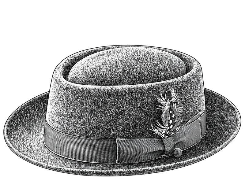
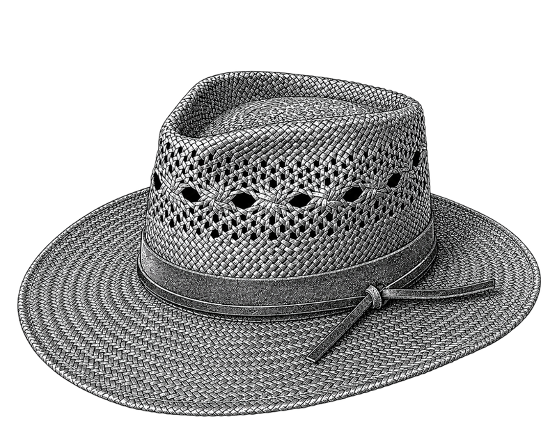
Hat color is the variable most likely to make an otherwise correct hat choice look wrong. The right silhouette in the wrong color creates a hat that does not belong to the face wearing it or the clothing surrounding it. The right color in the right silhouette creates a hat that appears to have always been part of how that person dresses. The difference is not subjective preference — it follows patterns that are learnable and applicable.
The Two Color Problems to Solve
Hat color has to work in two simultaneous relationships:
- Hat-to-face: The hat sits directly above the face. Its color is in the closest possible proximity to skin tone, hair color, and eye color. A hat color that clashes with or drains the face reads as wrong at the most basic level — you notice the hat before you notice the person wearing it.
- Hat-to-wardrobe: The hat functions as part of an outfit. It needs to work with the clothing palette the wearer actually wears, not an abstract ideal palette.
Most hat color advice addresses only the first problem. Both matter equally in practice.
Skin Tone and Hat Color: The Framework
The relevant variable is not just skin tone lightness or darkness — it is the undertone category: warm (yellow, peachy, golden), cool (pink, blue, neutral-cool), or neutral (between warm and cool). Hat colors that share undertone category with the wearer face read as harmonious; those that conflict read as discordant even when they are not obviously wrong at first glance.
Warm Undertones (Golden, Peachy, Olive Skin)
Warm-undertone skin has yellow, golden, or olive depth. Hat colors that work:
- Camel and tan: The gold warmth of camel felt mirrors the warmth in the skin without competing with it. The single most flattering neutral hat for warm-undertone faces.
- Brown and cognac: Earth tones with warm depth — dark tan, saddle brown, cognac — stay within the warm palette.
- Olive and warm greens: Natural army olive, warm forest green — the yellow component reads harmoniously with warm skin.
- Burgundy and deep rust: Warm reds and earth-reds work for warm undertones.
Colors to approach carefully:
- Cool gray and silver: Gray without warm undertones (blue-gray, silver-gray) can make warm-undertone skin appear sallow or muted by contrast.
- Very cool navy: A blue-base navy pulls the warm face in a slightly discordant direction, though the effect is less pronounced than with silver-gray.
Cool Undertones (Pink, Rosy, Blue-Hued Skin)
Cool-undertone skin has pink or blue-pink depth. Hat colors that work:
- Charcoal and slate gray: Cool-based neutrals work strongly with cool undertones — the gray reads as clean and clear against the pinkish face rather than dull.
- Navy blue: A natural color for cool-undertone faces — the blue component harmonizes with the cool skin depth.
- Black: Clean and high-contrast against cool undertone skin. Works well when the wearer coloring overall is dark enough to carry the contrast (dark hair, darker eyes). Can wash out very fair skin with cool undertones.
- Cool-tone burgundy and plum: Wines with a blue-purple depth rather than an orange-red depth work for cool undertones.
Colors to approach carefully:
- Camel and orange-based earth tones: The warmth of camel fights the cool undertone of the skin — the hat appears disconnected from the face.
- Warm rust and brick: Orange-red base tones conflict with cool-undertone faces.
Neutral Undertones
Neutral undertones have balanced warm and cool — the least constraining category. Most hat colors work. The variables become wardrobe integration (what colors does the wearer actually own) and visual contrast (does the hat color create enough contrast with hair and skin to register as a considered choice, rather than disappearing into the overall palette).
Hair Color and Hat Color: The Contrast Factor
The hat sits directly above the hair. The color relationship between hat and hair is as visible as the relationship between hat and face.
Dark hair: Provides maximum contrast opportunity. Dark-haired people can wear both light hats (natural straw, cream felt, light gray) and dark hats with clarity — the contrast is strong enough to read in both directions. The choice becomes: high contrast (light hat against dark hair, face-forward effect) or tonal harmony (dark hat with dark hair, more unified appearance). Both are deliberate choices rather than errors.
Light and blonde hair: Light hair against a light hat creates minimal contrast — hat and hair blend together and the hat can appear to disappear into the overall palette. Darker hat colors create the contrast that makes the hat register as a hat. Medium and dark tones (charcoal, navy, cognac, dark camel) work better than cream or pale straw against very fair hair.
Red hair: Red hair has warm undertones and high chroma. Hat colors that harmonize: camel, warm brown, olive, warm cream. Hat colors that clash: cool gray, navy, silver, cool-tone burgundy (the blue-pink competes with the warm red).
Gray and white hair: Gray and white hair is neutral to cool in most people. Light hat colors (cream, light tan, pale gray) blend into the overall palette; medium and darker neutrals create useful contrast. Warm camel against silver-gray hair tends to look slightly discordant; cool gray or navy tends to look cleaner.
Building a Hat Color Wardrobe
For a wearer building a hat wardrobe rather than buying individual hats, the most efficient approach is to identify three positions:
Core neutral: The hat color that works with 80% of what the wearer already owns. For warm-undertone wearers with predominantly earth-tone wardrobes, this is camel or mid-brown. For cool-undertone wearers with a gray-navy-black wardrobe, this is charcoal or navy.
Tonal accent: A hat in a complementary color within the same temperature family as the core neutral — a second color that creates variety without requiring rethinking the outfit.
Seasonal straw: A natural straw color (cream to light tan) for warm-weather use. Natural straw reads as warm in undertone and works best with warm and neutral undertone wearers; very fair, cool-undertone wearers may prefer white or light gray straw alternatives.
Find hats across the full color range — camel, charcoal, navy, natural straw — in the Hatloom collection.
Frequently Asked Questions
Can I wear a black hat with any outfit?
A black hat is the highest-contrast neutral and creates a strong visual statement against most clothing. It works when the overall outfit has sufficient darkness or contrast to support the weight of a black hat — dark clothing, strong color accents, or a wearer with dark hair who can carry the contrast. It can dominate a light outfit, leaving the hat as the most visually prominent element in a way that reads as unbalanced. Black is versatile, not universal.
What is the most versatile hat color?
Camel for warm-undertone wearers with earth-tone wardrobes; charcoal or medium gray for cool-undertone wearers. Both are neutral enough to work with most clothing colors while having enough warmth (camel) or clarity (charcoal) to avoid looking flat. Natural straw is the most versatile color for summer-only use. There is no single universally versatile hat color — versatility is always relative to the wearer skin tone and existing wardrobe palette.
Should my hat match my shoes?
A hat-to-shoes match is not required, but a hat-to-leather-accessories relationship is worth considering. A camel felt fedora with brown leather boots and a tan belt is a coherent palette. The same camel fedora with black leather shoes and a black belt is a minor key collision — not wrong, but not deliberate. Keeping the hat in the same temperature family (warm/cool) as the leather accessories is the practice that matters; exact color matching is not the goal.
Can I wear a light-colored hat in winter?
Yes, though it requires more deliberate outfit building than dark winter hats. Light-colored felt hats — cream, ivory, light stone — in winter contexts are a style statement (deliberately anti-seasonal) rather than a neutral choice. They require confident execution and a willingness to be visually prominent. If you wear a lot of dark clothing in winter, a light hat provides strong contrast that can look very intentional; worn with pastel or mixed-color winter clothing, it can read as seasonally confused.
What hat color is best for business professional settings?
Dark neutrals are the lowest social friction in professional contexts: charcoal, dark navy, dark brown. These read as considered and appropriate without making a color statement that requires stylistic conviction to support. Camel is the lighter neutral that still reads as professional in most business contexts. Avoid very light colors, patterns, or high-chroma colors in conservative professional settings — the hat should support the overall professional appearance without drawing independent attention.